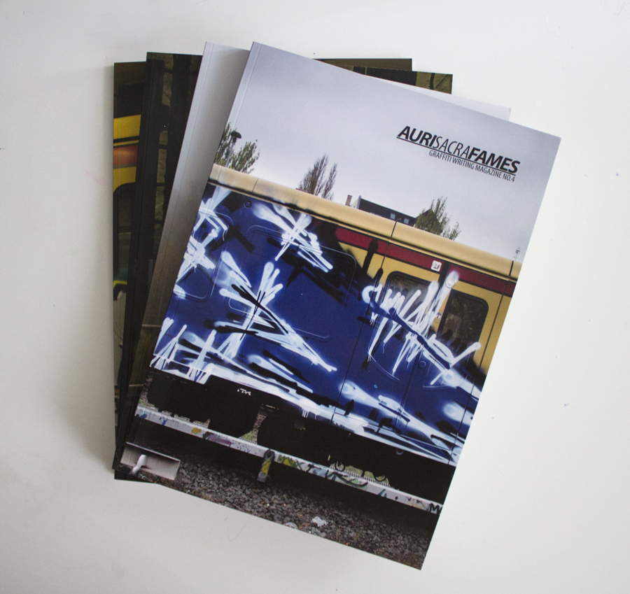
Only a the most unobservant tourist could be in Berlin and fail to notice the graff. And even then they’d probably find themself clattering into piles of empty spray tins as they traversed their way across the city. My point is that graffiti is as much a part of modern Berlin life as currywurst is. Now, it may well be possible to find a publication based around the local wurst scene but more interestingly for me there is a publication that represents Berlin’s graffiti. Auri Sacra Fames is a magazine that comes highly recommended, although until now I’ve not had the pleasure. The title of the magazine is actually Latin and translates as something like ‘hunger for gold’. At first glance the publication looks like it’s purely focused on trains but in actual fact it has a broader content. For this review I’ve got my hands on all four issues that have been published to date so first off I’ll describe the content of the latest copy and then compare it to the earlier ones.
The introduction to № 4 sets out the magazine as a documentary of Berlin graffiti which aims to be as objective as it can in its choice of content to achieve this. Turning over, the next couple of pages are covered by a wonderful shot of a U-Bahn going over a bridge with some graffiti strewn flats in the background. The image sets the standard for the rest of the magazine which has good quality photos throughout, as well as more impressive double-page train scenes. The first chapter of street tags is an unexpected treat that’s followed by a photo-report on Bazouka Joe. His abstract pieces, which pop up in quite a few other publications, aren’t completely unconventional but still unusual. Towards the end of the section is the story of one of Bazouka Joes trips to Swabylon (aka Swabia) where he describes the experience of painting in Stuttgart city. He amusingly declares that Baden-Württemberg, of which Stuttgart is the capital, is the place of “the creation of order by rules” – and in my ignorance I thought that was Germany!
Later in the magazine is another photo-interview with a New York writer called Ven. He is introduced, alongside a couple of shots of his own work, as a photographer and graffiti documentarian. The rest of the photos are a selection of some of his favourite photographs he has captured in Berlin. For each photo Ven provides a commentary of why he likes it and how he took it. In one instance an early morning tip off “from a non-writer friend” means zooming over to the correct station, getting a hasty shot whilst almost concussing himself, and then rushing off to another station to capture some more shots before the artwork disappears into a depot never to be seen again. The way this section is done is a concept that works well whilst presenting the opinion of the photographer, rather than the painter, is also an interesting angle.
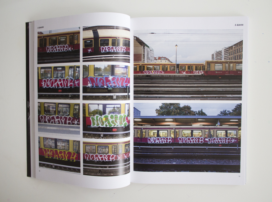
An exceptionally cool feature is that of the picket-line pieces that were done on Berlin S-Bahn trains during a particular railway union’s strike.
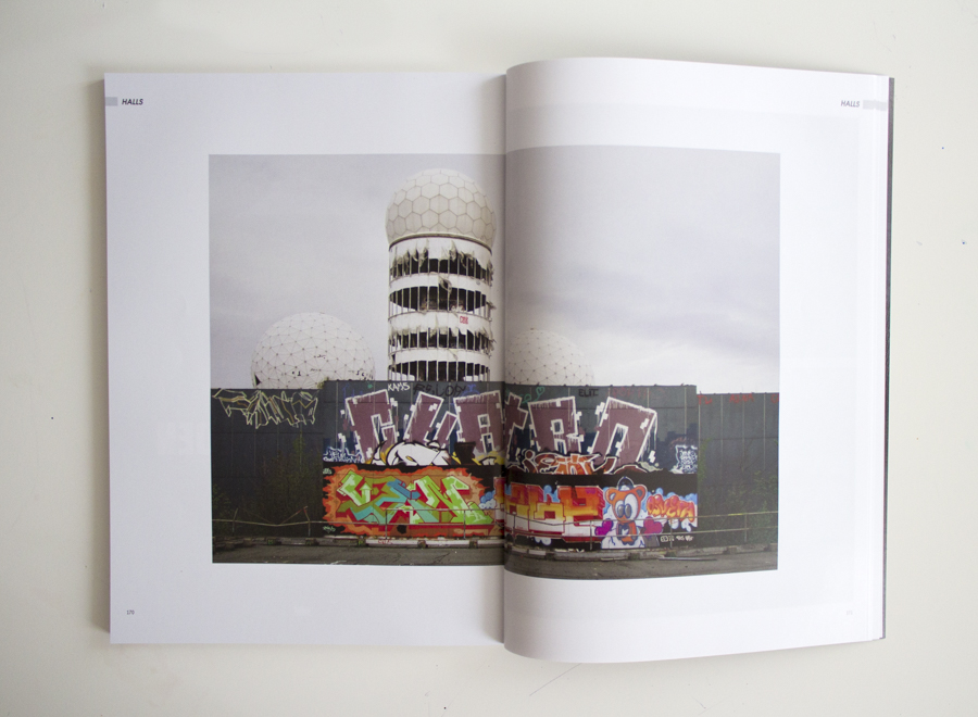
An exceptionally cool feature is that of the picket-line pieces that were done on Berlin S-Bahn trains during a particular railway union’s strike. Obviously, if there is a chapter of S-Bahns then there has to be a matching one of U-Bahns. These stylish works can be found filling up the last twenty-nine pages of the magazine! Elsewhere there is a ‘halls’ chapter of legal walls, while the centre of the mag is taken up with a Soultrainz section mainly of artistically captured S-Bahn trains. After this is a wicked ‘stations’ chapter of pieces done in Berlin stations. They are all taken off the platform, lots of high quality productions, lots of colour, and they just look really good on the tiled walls.
This fourth issue of ASF is typical of the whole series in that there are always chapters covering the different elements of graffiti in Berlin (halls, U-Bahn, stations etc) alongside various interviews or photo-reports. Compared to the first issue the magazine has grown in size with the most recent being over two-hundred pages long! However there is no loss in quality and the photographic content of all the magazines is mostly well sized, nicely laid out, and generally top-rate. ASF is also open to a whole range of different graffiti. In № 1, for example, there’s a funky 1UP/GHS piece with mushrooms, a rainbow, peace signs, and a character. In total contrast the opposing page shows a clever conceptual piece of a black filled picture frame surrounded by an explosion of colours with the caption; “art in a frame is like an eagle in a birdcage”. Later in the same issue is a train with some simple blocks of colour and, almost in parody of the earlier piece, next to them it says “conceptual, conceptual, conceptual”. This willingness to showcase more unusual work is evident in later issues too such as a report on Aris who paints unconventional silhouettes and landscapes on trains.
Although the magazine can only document what’s there, in the city it is restricted to, the content is presented in innovative ways. For example in ASF № 3 there is a section on the freights that pass through Berlin. Many of these have come from across Europe and so, while they make up part of the graffiti of Berlin, they also show work from beyond the boundaries of the city. Another good example of how the magazine uses it’s content cleverly is in the interview sections. Here you won’t find a bog-standard Q&A dialogue. Instead photos are often accompanied with descriptions or quotes from the artist. One interview with Skim and Shek, in № 2, has just a single photograph of a whole-car. In the text the pair explain the concept and motivation behind the piece. The single time that a Q&A is used is for an interview with the producers of the Unlike U film. In this case the technique is effective because the questions are not typical and set up a bit of background for each answer.
Context is all important with graffiti, and so it was the few photo-reports that lacked any text which didn’t work so well. The section of ASF that I found least engaging though was the ‘halls’ bit which focused on the legal side of things. However in the latest issue there is a short text contextualising the walls and describing their photographer. The explanation had me concentrating more on this section and it worked better. Leading me to conclude that in order to cover the Berlin scene accurately these legal walls should be included. Similarly the chapter on tags is important and I really liked looking at them – you can never have too many tags!
By far my favourite part of ASF is the ‘stations’ segment which is just quality. Another great feature are the illegal walls particularly in the third ASF. Unfortunately these have been dropped from № 4. However, looking through the magazines their format is subtly changed from issue to issue so I’m sure they’ll be back in the future. (Going off on a tangent I notice that ASF is one of those magazines that doesn’t put a name to a picture. I conducted an informal survey of my friends opinions on the matter. The result was that they all preferred a name underneath but when there isn’t one they spend more time studying each photograph – so the jury’s still out on that!) The strength of ASF lies in its openness, while the presentation of graffiti beyond trains is what makes it live up to its aim of documenting Berlin’s graffiti scene. Overall it is intelligently put together and a lot of thought has gone into it. An example of this attention to detail extends to the publications title which is both unusual and meaningful in that it alludes to a writers desire for fame and success. Auri Sacra Fames is proper quality, well produced, and pretty much sets the benchmark.