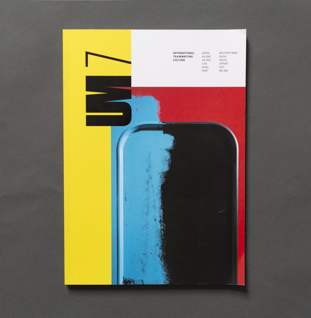
Considering it’s been around for seventeen years, and currently on their seventh issue, I’ve come to Unpleasant a bit late. Covering “international train writing culture” this publication has everything we’ve come to expect of high quality German magazines – it’s just a pity I’ve never picked it up before!

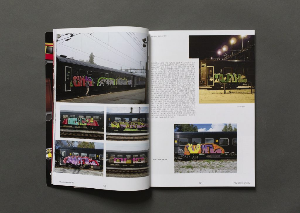
The content of this issue begins with a chapter titled ‘colourful krauts’ which, as you can imagine, is a collection of vibrant German trains. Later chapters contain a mixture of international stuff, various underground networks, and yet more domestic damage. All sorts of styles are represented with some cool ideas such as a wholecar covered in black & white throw-ups as if on the street, a seemingly ripped up Rache carriage, or some topiary letters being grazed on by a giraffe.
The majority of the magazine, however, is taken up with features on individual writers. The funkiest of these is about Aden who, not long after a serious mishap on the rails, began incorporating green aliens and other UFO themed elements into their graffiti. They also like to paint the tag ‘cunt’ on trains alongside the said body part with various objects emerging from them. There’s a definite life and birth theme to the graffiti and I’m sure a Freudian analysis could be made… which I won’t attempt. Suffice to say one of Aden’s alien characters aptly holds up a sign declaring “Attention. Thank you for your attention.”
Wilma seems to depart from letter-forms altogether
Another unusual chapter commemorates the twentieth anniversary of Essen’s CVA crew. A dozen or so photos highlight the group’s creative work on different rolling stock in their hometown and beyond. What makes the feature slightly different is that the accompanying texts have been written by the significant others of CVA members. It’s explained that the crew wanted a space “to give those who stood by our side for all of those years a voice.” This is a really nice idea and works well in giving an alternative yet intimate portrayal of this group committed to a life of graffiti.
I enjoyed reading the numerous interviews from Sweden, Poland, Italy and elsewhere but it was the features on Wilma and Astro which particularly stood out as their work sits in contrast to the more conventional letter-based graff in the rest of the mag. Examples of the latter involve sci-fi looking shapes that can be viewed as abstract letter-forms or just as easily as extraterrestrial mountain scapes. All the examples pictured are from Frankfurt’s U-Bahn which Astro questions whether or not can be called a genuine underground system at all, nevertheless that doesn’t stop the artist carefully preparing missions to paint their chosen canvass. Meanwhile Wilma seems to depart from letter-forms altogether and embraces the abstraction of coloured blocks and lines on trains. There are some cool flicks of Wilma’s work which vary from huge pieces that dominate the train, to more fine lines which could be mistaken for a new livery, and then odd blocks which use the design of the train to create portal-like spaces where windows and doors should be.
Unpleasant is a real nice mag with quality photos and contains decent articles. Will definitely be checking this publication out again in the future.

No Ⓐ this time…